From Asset Chaos to Risk Clarity
Redesigning an IT Asset & Risk Management Platform

Year
2025
Category
GRC
ROLE
Product Designer
Segment
B2B SaaS
Duration
6 MONTHS
The Story Behind the Project
In modern organizations, IT risk is no longer a purely technical concern, it is a business-critical responsibility.
CISOs and IT Risk Managers are expected to:
-Maintain visibility over internal IT systems and third-party vendors,
-Ensure compliance with regulatory frameworks,
-Make high-impact decisions based on incomplete and constantly changing information.
This platform was created to support exactly that: a centralized system for managing IT assets and assessing IT-related risks across the organization. Over time, however, the product became harder to use, not because the users lacked expertise, but because the experience didn’t support how they actually work.
01
The primary users
The redesign focused on two core personas:

CISO (Chief Information Security Officer)
-Responsible for the organization’s overall risk posture.
-Needs a clear, high-level understanding of risk exposure.
-Focuses on prioritization, accountability, and decision-making.
-Requires confidence that risk assessments are consistent and defensible.

IT Risk Manager
-Works daily with asset data, threats, and vulnerabilities.
-Performs detailed risk identification and assessment.
-Needs efficient workflows and clear process guidance
-Balances compliance requirements with operational reality.
02
02
The challenge
The challenge
The challenge was not a lack of features or domain expertise. The challenge was making a complex, compliance-driven system usable and trustworthy for two very different perspectives: strategic oversight (CISO), and operational execution (IT Risk Manager).
The platform contained all the necessary information, but it did not consistently: surface what matters most at a given moment, support sense-making across long, complex flows, or clearly connect asset-level data to risk-level decisions.
As a result, understanding risk required effort and interpretation.. rather than being supported directly by the product.
03
03
Design goal
Design goal
The goal of the redesign was to reframe the experience around clarity and decision-making, without simplifying the underlying domain.
The goal of the redesign was to reframe the experience around clarity and decision-making, without simplifying the underlying domain.
We aimed to:
-Create a shared foundation for internal and third-party asset management.
-Support structured, auditable IT risk processes.
-Present information in a way that adapts to the needs of both CISOs and IT Risk Managers.
We aimed to:
-Create a shared foundation for internal and third-party asset management.
-Support structured, auditable IT risk processes.
-Present information in a way that adapts to the needs of both CISOs and IT Risk Managers.
The success of the redesign would be measured not by visual change alone, but by whether the product could: help users understand risk faster, explain it more confidently, and act on it with less cognitive effort.
The success of the redesign would be measured not by visual change alone, but by whether the product could: help users understand risk faster, explain it more confidently, and act on it with less cognitive effort.
04
04
My role
My role
As the Product Designer, I led the redesign end to end, focusing on structuring complexity rather than hiding it.
As the Product Designer, I led the redesign end to end, focusing on structuring complexity rather than hiding it.
The rules that guided every design decision
Redesigning an enterprise IT asset and risk management platform is not about simplifying the domain, it’s about structuring complexity in a way that supports decision-making. These principles guided every UX and UI decision throughout the project.
01
Design for Decisions, Not for Data
CISOs and IT Risk Managers work with large volumes of data every day. What they need is not more information, but clarity around what matters now.
01
Design for Decisions, Not for Data
CISOs and IT Risk Managers work with large volumes of data every day. What they need is not more information, but clarity around what matters now.
02
Assets First, Risk Follows
IT risk does not exist on its own. It emerges from the context of an asset, whether internal or third-party.
03
Different Roles, Shared Truth
CISOs and IT Risk Managers operate at different levels of abstraction, but their decisions must be based on the same, trustworthy data.
04
Make the Process Visible
In long, compliance-driven workflows, orientation is critical. The experience continuously answers: Where am I in the process? What information am I working with? What comes next?
The rules that guided every design decision
Redesigning an enterprise IT asset and risk management platform is not about simplifying the domain, it’s about structuring complexity in a way that supports decision-making. These principles guided every UX and UI decision throughout the project.
01
Design for Decisions, Not for Data
CISOs and IT Risk Managers work with large volumes of data every day. What they need is not more information, but clarity around what matters now.
02
Assets First, Risk Follows
IT risk does not exist on its own. It emerges from the context of an asset, whether internal or third-party.
03
Different Roles, Shared Truth
CISOs and IT Risk Managers operate at different levels of abstraction, but their decisions must be based on the same, trustworthy data.
04
Make the Process Visible
In long, compliance-driven workflows, orientation is critical. The experience continuously answers: Where am I in the process? What information am I working with? What comes next?
Key improvements
Starting with the CISO perspective...
Reframing the Dashboard for the CISO
The redesign intentionally started with the CISO dashboard. For CISOs, the dashboard is not a workspace..it is a decision surface. Before making design decisions, I focused on understanding what information CISOs actually need to see first when opening the platform, and how they mentally frame IT risk at a high level.
Grounding the Redesign in Research
I conducted interviews to understand:
-How CISOs think about IT risk on a daily basis,
-What signals they look for when assessing risk exposure,
-And which information they expect to find immediately on a dashboard.
A consistent theme emerged: CISOs wanted clear separation, strong prioritization, and fast orientation , not operational detail.
Clear Separation of Asset Context
One of the strongest, consistently validated insights was the need for explicit separation between internal IT assets and third-party assets at the dashboard level.
Participants emphasized that:
internal assets and third-party vendors are governed differently,
they carry different types of risk and accountability,
and they require different follow-up actions.
Based on this, the redesigned dashboard introduces:
dedicated, first-class views for IT assets and third-party assets,
organized into separate tabs,
while still connected through a shared risk model.
Drag the slider to switch between versions. Move left to see the redesigned version, right to view the old one.
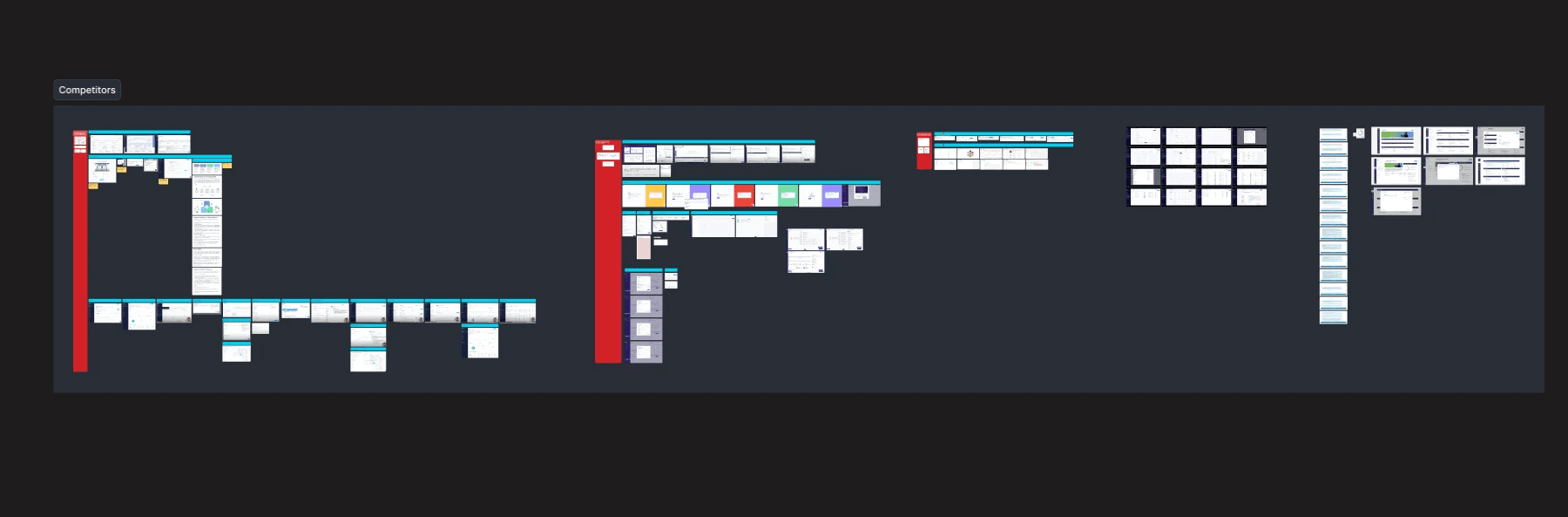
From insight to direction
Based on these insights, we made a conscious decision not to compete within existing categories. Of course, we found points from the analysis that we could leverage, but Instead of building:
a better OKR tool...
a better presentation experience...
or another performance dashboard...
we chose to focus on a problem that was not clearly owned by any existing solution: organizational strategy alignment.
The MVP
Based on the insights and our decision mentioned above, we defined an MVP that covers the essential problems while keeping the scope manageable.
While many features could have been included, we intentionally kept the MVP problem focused designed to directly address the key pain points rather than deliver a broad set of functionalities.
01
Predefined Strategy Elements
To ensure consistency and guide users, predefined elements were included so that strategies could be built in a structured and aligned way.
02
OKR Map
A central tool for building and visualizing Objectives and Key Results, enabling Strategy Owners to create a coherent strategy and track progress.
03
Strategic Dashboard
Provides leadership with a high-level view of how strategies are evolving, highlighting critical changes, whether in Objectives, Key Results, KPIs, or Risks..so users can make informed, timely decisions.
04
Presentation Mode
Enables Strategy Owners to communicate their strategy clearly to stakeholders, framing the OKR Map as a strategic narrative rather than just a list of metrics. This supports alignment discussions and decision-making at a business level.
05
Collaborative Alignment
Contributors can engage with the strategy through commenting and feedback, supporting alignment across teams without creating conflicts. Collaboration is built in as a mechanism for strategic coherence, not just a nice-to-have feature.
After defining the MVP and gathering the relevant information, I began designing the user flows and journeys, which we then reviewed and discussed with the team…
Following several pages of sketches to explore ideas and refine concepts, I started diving into high-fidelity design, translating the early concepts into detailed, interactive layouts.
01
Creating a shared language for strategy
Standardised building blocks for clear, aligned strategy.
The problem it addresses
In large organisations, strategy discussions often break down due to inconsistent structure and language. Teams describe similar concepts in different ways, strategies become overly verbose or fragmented, and critical context gets lost when strategies are shared, presented, or revisited over time. Without a common structure, strategy becomes difficult to compare, evolve, or connect, especially across organisational units and leadership levels.
The design intent
The Strategy Elements were designed as standardised building blocks of strategy. Rather than over-innovating on individual elements, we intentionally focused on simplicity, clarity, and consistency.
Each element follows the same highlevel structure: a clear name, concise descriptions, and optional depth, allowing users to focus on what they are saying, not how to structure it. By providing predefined elements (such as Vision, Sales Tactics, Competition, Investment Needs, or Financial Projections), the system helps teams speak the same strategic language across the organisation.
The outcome
The result is a strategy that is easier to build, easier to understand, and easier to communicate. Strategy Elements create a shared foundation that supports alignment, comparison, and reuse, while remaining flexible enough to accommodate different strategic contexts and levels of detail. They also serve as the conceptual backbone for higher-level features, such as the OKR Map, ensuring that execution is always grounded in clearly articulated strategic intent.
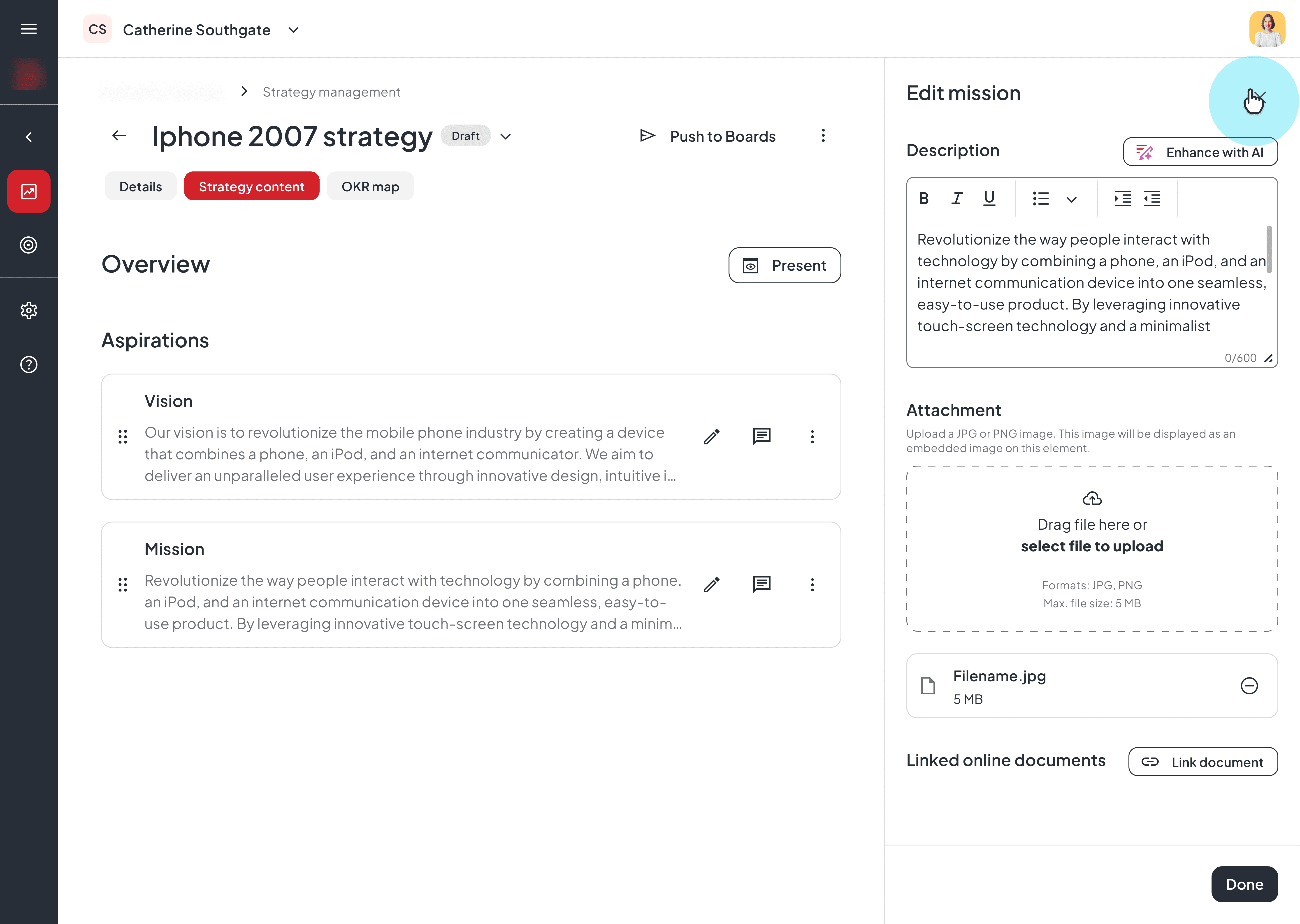
Strategy Elements – Breakdown

Standardised structure, flexible content
Each Strategy Element follows the same consistent structure: a clear name, a short summary, optional longer descriptions, and supporting materials such as images. This allows users to quickly scan, understand, and present strategy, while still enabling deeper context when needed. By standardising the format rather than the content, the system supports both clarity and nuance, without overwhelming users with unnecessary complexity.

Enabling structured collaboration around strategic intent
Strategy Elements are not treated as static documentation, but as shared discussion spaces. Users can leave comments directly on individual elements, allowing teams to ask questions, challenge assumptions, and provide feedback in the exact context where strategic decisions are defined.
Why these elements matters
Strategy Elements create a shared, standardized language for strategy work, turning inherently abstract concepts—like positioning, competition, or investment needs—into clear, comparable, and reusable building blocks across the organization. By simplifying how strategy is defined, communicated, and evaluated, they reduce ambiguity, accelerate alignment, and enable teams to make more consistent, data‑informed decisions at scale.
Strategy Elements – Breakdown
Standardised structure, flexible content
Each Strategy Element follows the same consistent structure: a clear name, a short summary, optional longer descriptions, and supporting materials such as images. This allows users to quickly scan, understand, and present strategy, while still enabling deeper context when needed. By standardising the format rather than the content, the system supports both clarity and nuance, without overwhelming users with unnecessary complexity.
Enabling structured collaboration around strategic intent
Strategy Elements are not treated as static documentation, but as shared discussion spaces. Users can leave comments directly on individual elements, allowing teams to ask questions, challenge assumptions, and provide feedback in the exact context where strategic decisions are defined.
Why these elements matters
Strategy Elements create a shared, standardized language for strategy work, turning inherently abstract concepts—like positioning, competition, or investment needs—into clear, comparable, and reusable building blocks across the organization. By simplifying how strategy is defined, communicated, and evaluated, they reduce ambiguity, accelerate alignment, and enable teams to make more consistent, data‑informed decisions at scale.
02
From Static Strategy to Living OKRs
A shared, visual OKR Map that helps leaders and teams align, discuss, and continuously mature strategy across the organisation.
The problem it addresses
In large organisations, strategies often fail not because they are poorly defined, but because they are hard to operationalise. Objectives live in decks, key results in spreadsheets, and progress updates in siloed tools. This fragmentation makes it difficult for leaders to understand how strategic intent translates into real outcomes and for teams to see how their work connects back to strategy.
The design intent
The OKR Map was designed as a central orchestration layer between strategy definition and execution. Instead of enforcing rigid hierarchies, we intentionally modelled OKRs as a network, allowing objectives, key results, and risks to connect across strategies, organisational units, and ownership boundaries. This reflects how strategy actually evolves in complex enterprises.
The outcome
The result is a shared mental model for strategy: one that supports building, presenting, discussing, and continuously refining OKRs over time. Strategy Owners can clearly articulate intent, Contributors can meaningfully engage and iterate, and leadership gains visibility into alignment and progress, all in one place.
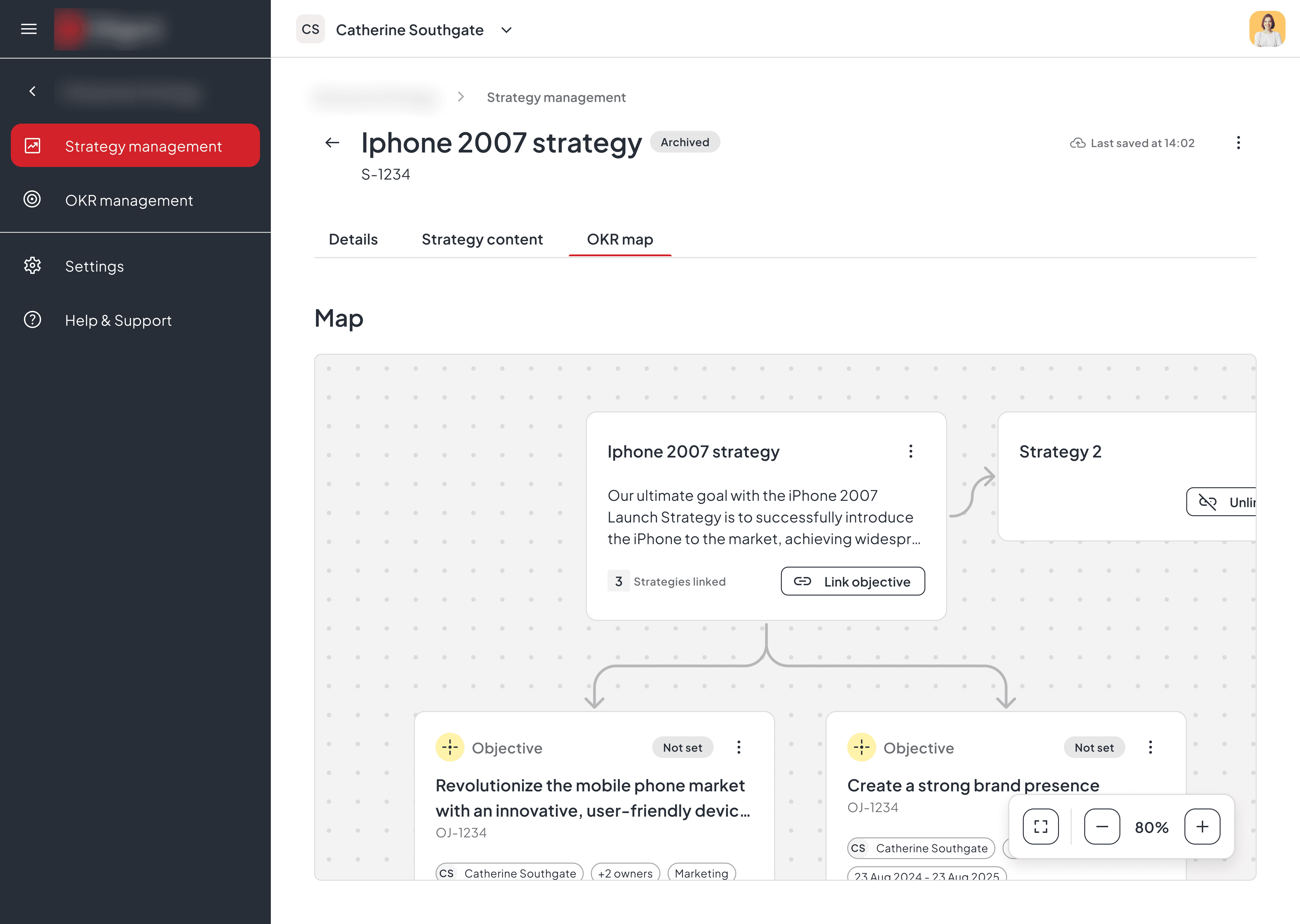
OKR Map breakdown
Creating OKRs in context, not in isolation
Strategy Owners start from an already defined strategic foundation: vision, goals, and more strategic elements. They can build OKRs directly on top of it. Objectives and Key Results, Risks are added incrementally, renamed, refined, or removed as understanding deepens. This supports a learning-driven strategy process, where clarity emerges through iteration rather than upfront perfection.

Operationalising OKRs through ownership, structure, and measurable outcomes
Objectives and Key Results, Risks are not just defined ..they are owned, structured, and actively managed. Within the OKR Map, owners can assign responsibility, link these objects to organisational units, and explicitly set status, progress, and success metrics.
Why the OKR Map matters
The OKR Map enables users to align objectives, measure progress, and manage risks in one connected model. By making ownership, progress, and risk explicit, it helps organisations execute strategy with clarity, accountability, and awareness.
OKR Map breakdown
Creating OKRs in context, not in isolation
Strategy Owners start from an already defined strategic foundation: vision, goals, and more strategic elements. They can build OKRs directly on top of it. Objectives and Key Results, Risks are added incrementally, renamed, refined, or removed as understanding deepens. This supports a learning-driven strategy process, where clarity emerges through iteration rather than upfront perfection.
Operationalising OKRs through ownership, structure, and measurable outcomes
Objectives and Key Results, Risks are not just defined ..they are owned, structured, and actively managed. Within the OKR Map, owners can assign responsibility, link these objects to organisational units, and explicitly set status, progress, and success metrics.
Why the OKR Map matters
The OKR Map enables users to align objectives, measure progress, and manage risks in one connected model. By making ownership, progress, and risk explicit, it helps organisations execute strategy with clarity, accountability, and awareness.
03
High‑Level Strategy Dashboard
A single, real‑time view that brings strategic clarity to the entire organization.
The problem it addresses
As organizations mature, the volume, velocity, and complexity of their strategic initiatives grow. While OKR Maps reveal alignment and Strategy Elements standardize language, leaders still lack a centralized place to monitor how strategies evolve, where issues emerge, and what decisions require their attention. The High‑Level Dashboard addresses this gap by giving executives and teams a unified, always‑up‑to‑date picture of the health, progress, and risks of their strategy landscape.
The design intent
The goal was to design a high-level cockpit that surfaces only what matters: the momentum of strategic initiatives, their interdependencies, key risks, and upcoming decision points. The dashboard had to be visually lightweight, cognitively low‑load, and prioritization‑friendly—enabling leaders to instantly understand the state of their organization without diving into multiple screens.
The outcome
With the High‑Level Dashboard in place, leadership gets real‑time indicators of progress, bottlenecks, ownership, and risk exposure. Instead of weekly meetings to “sync the strategy,” teams can focus their conversations on solutions and actions.
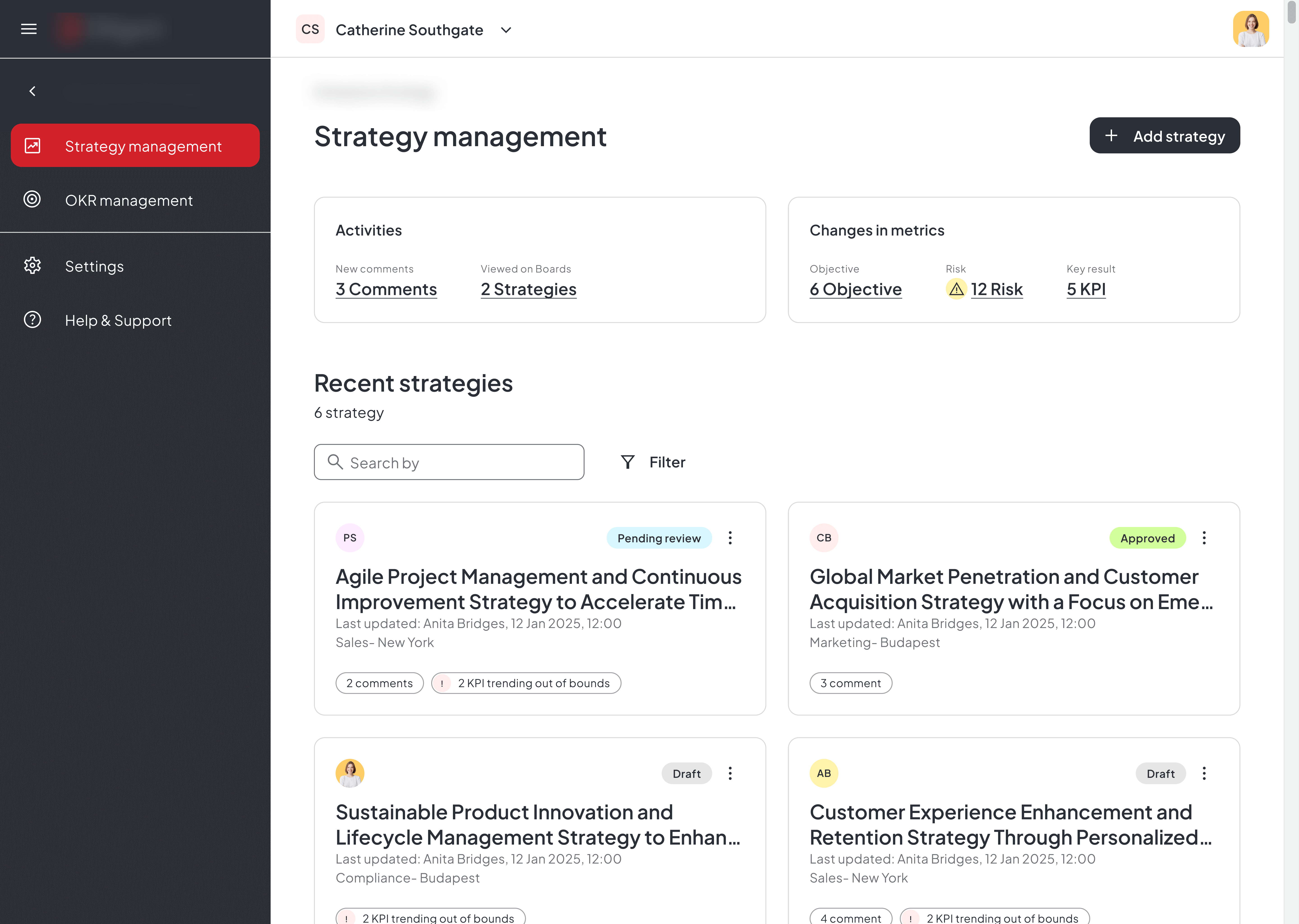
Dashboard breakdown
The heartbeat of strategic progress.
This view aggregates all active strategies into a single overview panel, displaying their status, trajectory, confidence levels, and risk indicators. It allows leaders to understand at a glance which initiatives are on track, which require intervention, and where emerging patterns may signal misalignment or opportunity. The design intentionally reduces noise and builds trust through clarity and consistency.

A dynamic feed of changes that shape your strategy.
This view surfaces all meaningful events that could influence a given strategy: from OKR updates and shifting priorities to risk signals, ownership changes, or new dependencies. Instead of hunting for updates across teams and tools, leaders see a curated, contextualized stream of what has changed, why it matters, and which strategies may be affected. It turns scattered updates into actionable intelligence, allowing teams to respond faster and adjust their strategic path with confidence.
Why the dashboard matters
The High‑Level Strategy Dashboard matters because it gives leaders a continuously updated, unified understanding of how their strategies evolve.. not just in terms of progress, but in response to real organizational change. By combining real‑time strategic metrics with a curated stream of meaningful events and notifications, it becomes possible to spot emerging risks, understand the impact of OKR changes, and react before misalignment spreads. This transforms strategy from a static plan into a living system: one that surfaces what’s changing, why it matters, and where actions are needed
While several further concepts were in progress (including Presentation Mode and AI flows), the project concluded at this point, so this case study focuses on the completed core foundations.
Dashboard breakdown
The heartbeat of strategic progress.
This view aggregates all active strategies into a single overview panel, displaying their status, trajectory, confidence levels, and risk indicators. It allows leaders to understand at a glance which initiatives are on track, which require intervention, and where emerging patterns may signal misalignment or opportunity. The design intentionally reduces noise and builds trust through clarity and consistency.
A dynamic feed of changes that shape your strategy.
This view surfaces all meaningful events that could influence a given strategy: from OKR updates and shifting priorities to risk signals, ownership changes, or new dependencies. Instead of hunting for updates across teams and tools, leaders see a curated, contextualized stream of what has changed, why it matters, and which strategies may be affected. It turns scattered updates into actionable intelligence, allowing teams to respond faster and adjust their strategic path with confidence.
Why the dashboard matters
The High‑Level Strategy Dashboard matters because it gives leaders a continuously updated, unified understanding of how their strategies evolve.. not just in terms of progress, but in response to real organizational change. By combining real‑time strategic metrics with a curated stream of meaningful events and notifications, it becomes possible to spot emerging risks, understand the impact of OKR changes, and react before misalignment spreads. This transforms strategy from a static plan into a living system: one that surfaces what’s changing, why it matters, and where actions are needed
While several further concepts were in progress (including Presentation Mode and AI flows), the project concluded at this point, so this case study focuses on the completed core foundations.
Outcome
This project allowed me to work in one of the most complex problem spaces a product designer can face: helping an organization understand, structure, and execute strategy at scale. Even though not every planned feature made it to implementation, the work I delivered from conceptual frameworks to scalable interaction patterns, laid the foundation for how strategic workflows, clarity, and decision‑support could evolve in the product. Through this process, I grew significantly as a product designer: in how I clarify ambiguity, structure strategic information, collaborate with stakeholders, and define systems that can scale over time.
01
Strategy tools require exceptional information architecture.
I learned how critical it is to design systems that bring order to inherently unstructured information. Working on OKR mapping, strategy elements, dashboards, presentation flows, and AI use cases sharpened my ability to define hierarchies, patterns, and navigational clarity for complex data.
03
Ambiguity is part of the craft and an opportunity.
As priorities shifted and the project evolved, I developed a stronger ability to stay focused on the core problem, adapt fast, and create clarity for others. These experiences deepened my resilience and strengthened my strategic design thinking.
02
Designing for leaders means designing for cognitive load.
A key insight was that executives don’t need more data, they need the right signals. This shaped how I prioritized content, surfaced events, and created visual rhythms that support quick, confident decision‑making.
04
A project doesn’t need full delivery to drive meaningful design growth.
Even though some planned modes like Presentation Mode and AI-enhanced strategy support,didn't progress to implementation, exploring them pushed me to think beyond UI design and focus on end‑to‑end workflows, user value, and long-term scalability.
Outcome
This project allowed me to work in one of the most complex problem spaces a product designer can face: helping an organization understand, structure, and execute strategy at scale. Even though not every planned feature made it to implementation, the work I delivered from conceptual frameworks to scalable interaction patterns, laid the foundation for how strategic workflows, clarity, and decision‑support could evolve in the product. Through this process, I grew significantly as a product designer: in how I clarify ambiguity, structure strategic information, collaborate with stakeholders, and define systems that can scale over time.
01
Strategy tools require exceptional information architecture.
I learned how critical it is to design systems that bring order to inherently unstructured information. Working on OKR mapping, strategy elements, dashboards, presentation flows, and AI use cases sharpened my ability to define hierarchies, patterns, and navigational clarity for complex data.
02
Designing for leaders means designing for cognitive load.
A key insight was that executives don’t need more data, they need the right signals. This shaped how I prioritized content, surfaced events, and created visual rhythms that support quick, confident decision‑making.
03
Ambiguity is part of the craft and an opportunity.
As priorities shifted and the project evolved, I developed a stronger ability to stay focused on the core problem, adapt fast, and create clarity for others. These experiences deepened my resilience and strengthened my strategic design thinking.
04
A project doesn’t need full delivery to drive meaningful design growth.
Even though some planned modes like Presentation Mode and AI-enhanced strategy support,didn't progress to implementation, exploring them pushed me to think beyond UI design and focus on end‑to‑end workflows, user value, and long-term scalability.
Outcome
This project allowed me to work in one of the most complex problem spaces a product designer can face: helping an organization understand, structure, and execute strategy at scale. Even though not every planned feature made it to implementation, the work I delivered from conceptual frameworks to scalable interaction patterns, laid the foundation for how strategic workflows, clarity, and decision‑support could evolve in the product. Through this process, I grew significantly as a product designer: in how I clarify ambiguity, structure strategic information, collaborate with stakeholders, and define systems that can scale over time.
01
Strategy tools require exceptional information architecture.
I learned how critical it is to design systems that bring order to inherently unstructured information. Working on OKR mapping, strategy elements, dashboards, presentation flows, and AI use cases sharpened my ability to define hierarchies, patterns, and navigational clarity for complex data.
03
Ambiguity is part of the craft and an opportunity.
As priorities shifted and the project evolved, I developed a stronger ability to stay focused on the core problem, adapt fast, and create clarity for others. These experiences deepened my resilience and strengthened my strategic design thinking.
02
Designing for leaders means designing for cognitive load.
A key insight was that executives don’t need more data, they need the right signals. This shaped how I prioritized content, surfaced events, and created visual rhythms that support quick, confident decision‑making.
04
A project doesn’t need full delivery to drive meaningful design growth.
Even though some planned modes like Presentation Mode and AI-enhanced strategy support,didn't progress to implementation, exploring them pushed me to think beyond UI design and focus on end‑to‑end workflows, user value, and long-term scalability.
Closing Note
This project expanded my skillset as a product designer: shaping how I think about systems design, strategic clarity, organizational alignment, and the role of design in high‑impact decision-making spaces. It taught me how to bring structure to complexity, how to collaborate effectively with stakeholders, and how to create design foundations that can evolve even when timelines and priorities shift.
